Following a similar pattern, Thunar is file management utility (file manager) is a very close resemblance to the Mac OSX finder. Anyhow although the post itself is a bit old (about 2-3 weeks :/) but I was reading a post in Xfce Wiki page that addresses a current issue with the Thunar.
By default both the desktop and the file manager GUI are designed to be really simple but if you use the left panel that displays folder paths, mounted partitions, etc (like with "explorer" in MS Windows) then the more devices/partitions, remote locations, etc that you mount on the Thunar opensource file manager... it makes the GUI exactly like what the developers trying so hard to avoid. It just makes it look more cluttered (yikes).
So in their attempt to trying to find a way out of this (no worries, they ain't gonna remove the side-pane :P) the developers have come up with a new design, well it's not new actually as said they're borrowing some ideas from OSX finder (the file/document management utility for Mac OSX).
 |
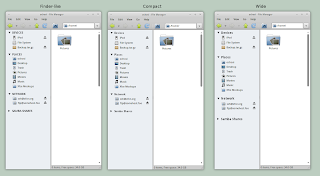
| After the new GUI implementation... still shows all the devices/folders yet less complications ;-)... |
Although at first they came up with a GUI that looks a bit confusing and doesn't look that good at all but then after few discussions now they've settled down for something that looks like the below screenshots which looks clean and simple.
So as anyone can see what they've done basically is, unlike in the past in the shortcuts-pane where the devices are displayed under a single "category" but this time they're displayed using different categories (different one for partitions, Networks folders, etc) + most importantly now the users can hide/unhide the mounted devices/folders using the standard "expander buttons" which save the "side-pane" space and preserve the simplicity in general as well.
As a final, from a user point of view, yes this is great news. If you have a lot of HDD partitions, devices and network folders still want a simple fast loading file management tool then the new Thunar is looking awesome but on the other hand it's a bit sad to think of the "common belief" that, every time you want to solve a problem in GNU/Linux as a developer that you have to look at Apple :/...


No comments:
Post a Comment