
But after hearing the Beta 2 is out now we have like few weeks left and another RC left before the official launch of 11.10, I thought the Beta version 2 should be much closer to the official release of the long awaited 11.10 thus it's about time that I'd try to come up with a review.
So remember, all the feature that I'm gonna talk about are the changes from the current 11.04 Natty release thus if you've used 11.10 since the beginning you may already experienced these features (so don't blame me dudes! :D).
 |
| The desktop is identically the same, except the "right-click" now is even simplified (the "Create new Launcher", which is useful as hell for some, is removed)... |
As most knows, Unity carries some fundamental difference the way desktop UI designs, etc. But it still uses a lot of Gnome's applications thus most of the differences that we see in individual applications such as in "System Settings", user management, etc are due to the changes in the Unity's implementation of the Gnome 3 applications.
Let's begin with some of the changes in the Unity interface changes...
*. "Dash" icon: Except for a single major change, the application launcher is almost the same as in 11.04 version and still it lacks some serious customization abilities.
Anyhow, the most noticeable change is the "Dash" icon, which is now sits on top of the launcher which used to be on the left edge of the screen.

As many others, I also think this is a good move since it helps to make the most out of the screen since if you use something like a small screen device, say a netbook, then every pixel counts!.
And when you click on the "Dash" icon then on the left-edge we're greeted with a a "close/maximize" buttons (the minimize is disable which makes sense). So now you can easily close the window by using your mouse thanks to this without the need of the "Esc" button.

*. Buttons on the "exact left-edge": Thanks to the little movement of the "Dash" icon, now buttons are arranged on the very left-edge on the screen previously they used to just after the "Dash" icon. This helps to give a more sensible location + until you maximize a window you'll see a the name of the app/window (or whatever that you're using) on the left-edge (as with below screnshot).
 |
| Note the "Text Edi" to the left where the "Dash" icon used to be... |
*. The new "Alt-tab" UI: This is another beautiful looking "window switching" utility which was implemented sometime ago. But for some reason, while I was using it, if I had already an un-minimized window on my desktop screen then the "Alt-tab" display behind it which is not helpful at all since to serve its purpose it should always be on top of everything.
Other than that it looks beautiful and worked nicely.

*. New appearance Window: The appearance window section has also gone through some major changes and I gotta say it looks more polished and professional.

Arranging or adding images is really easy too but the themes have been reduced to four. The standard Ambiance theme + the Radiance version is there as the default ones and two version of the "High contrast" themes ... that's about it for themes.
This makes sense in a way and I guess having one or two themes by default helps the "branding" of Ubuntu but as long as you have a working internet connection around you... installing a new one is pretty darn easy nonetheless.
The Ambiance theme also has gone through few changes it seems. The tittle bar has lost somewhat its "3d-ness" as you can see with the below screenshot when comparing with the 11.04 version.
| Perhaps the middle strip is a bit too "thick/sharp"... |
 |
| "Something is wrong with me... help!" :P... |
*. All new Ubuntu Software Center: This is another major decision by Canonical to drop the Synaptic graphical package manager and replace it with the Ubuntu Software Center.

Now in the past USC was painfully slow and did require reasonable amount of system resource while installing applications, etc. But the 'new" one feels a bit faster and has gone through some major changes, at first I didn't even recognize her! (kidding).
Although the "Our star apps" takes a huge space out of that window which is waste since as long as I was using it didn't do anything other than displaying that "message". The only good thing about is that you can access all the "starred" apps by clicking on it. Other than that... that's A waste.
 |
| Users: Um, what exactly is your purpose again? | USC Star-apps Logo: "Well I'm here for... oh you know, I mean I do that... that, but ..." |
Other that the UI changes the performance is also improved but not by a huge margin, while I was using it. And I don't think they can make it as fast as Synaptic because USC is designed for achieving different goals (Mark did mention about "different ways of monetizing Ubuntu", nothing wrong with that anyway). But there's still room for improvement but for a start, this is not bad.
The preferences window and the menu are almost the same and nothing major to report there.
 |
| "ahh the same old me..." |

And as said, most of the individual application changes inside the System Settings, such as Keyboard layout changing or user management is due to the Gnome 3 changes thus has nothing to do with Ubuntu.
The new "Screenshot tool" does something cool (highly relative :D). Now whenever you take a screenshot, it'll output a camera shutter sound + will "white" the heck out of your screen too :).
 |
| Ehh... what was that all about! :D... |
Other minor changes includes such as: the default image viewer is the one comes with Gnome desktop thus if you wan to crop, etc then you'll have to use the Shotwell (which is also installed by default).
LibreOffice still comes without the "indicator menu" support. If they can't find a work-around that... it could be a bit disappointing when 11.10 comes out.

Oh one more small thing, the Terminal window now has a small White strip around it (as in the below screenshot) which looks awesome!. Since this is still one of the most widely used utilities in GNU/Linux... I think most would love it.

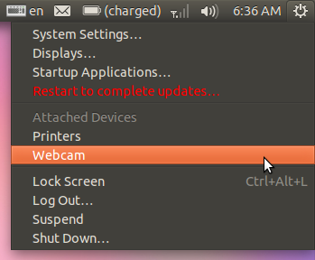
The "System Settings" menu has also received few new options. Now you can use it to configure network printers, add a web-cam software (which will take you to installing the Cheese web cam utility in USC), access display settings (another useful update) and startup applications and can configure attached devices directly from the menu as well.
The Shutdown menu is also changed quite a little which now lets you reboot as well.

How was the performance??
Well, I didn't measure the seconds but things were noticeably faster (startup/boot, etc) and the new LightDM theme also loads fast (looks good too). If you use AMD fusion chips, then 11.10 comes with the latest builds of the Kernel 3.0 which brigs enhanced support for these never chips (including ARM). I'm also quite pleased with the open-source ATI/AMD GPU driver which worked really well under Compiz without any issues whatsoever + it detected my monitor this time correctly.
As always, if you want the best performance, then I highly suggest that you install the proprietary driver.
But I'm not entirely happy with the ACPI since the Fan on my netbook kept running in a decent speed (even while I wasn't doing anything at all) but I cannot blame this on Ubuntu since it could be some issue with the Kernel and most probably is related to my hardware specifications.
To be honest I've been one of these that criticized the Unity desktop for sometime but after using it for sometime + when looking at the changes in the 11.10, although they aren't that "huge", but from a users perspective these small changes do make a difference and I actually love the Unity desktop.
But as with Gnome Shell, Unity has its issues and some absolutely hate it (which is totally understandable, but for me personally it only needed just a little getting used to).
But if you're an average computer user or someone who's new to GNU/Linux and still learning about Ubuntu and other stuff from scratch and looking for a professional looking GNU/Linux distribution that's slightly faster than the predecessors + which is user friendly too: then I gotta say that I was a bit wrong about the Unity interface and even though it's still at its beta stage, yet, I think Ubuntu 11.10 looks really good.
So if you can't even wait till its out officially... then other than installing it in commercial environment I think it's really stable (although Nautilus 3.1 crashed ones, yikes!) enough that you can give it a try, safely :). Good luck.
No comments:
Post a Comment